
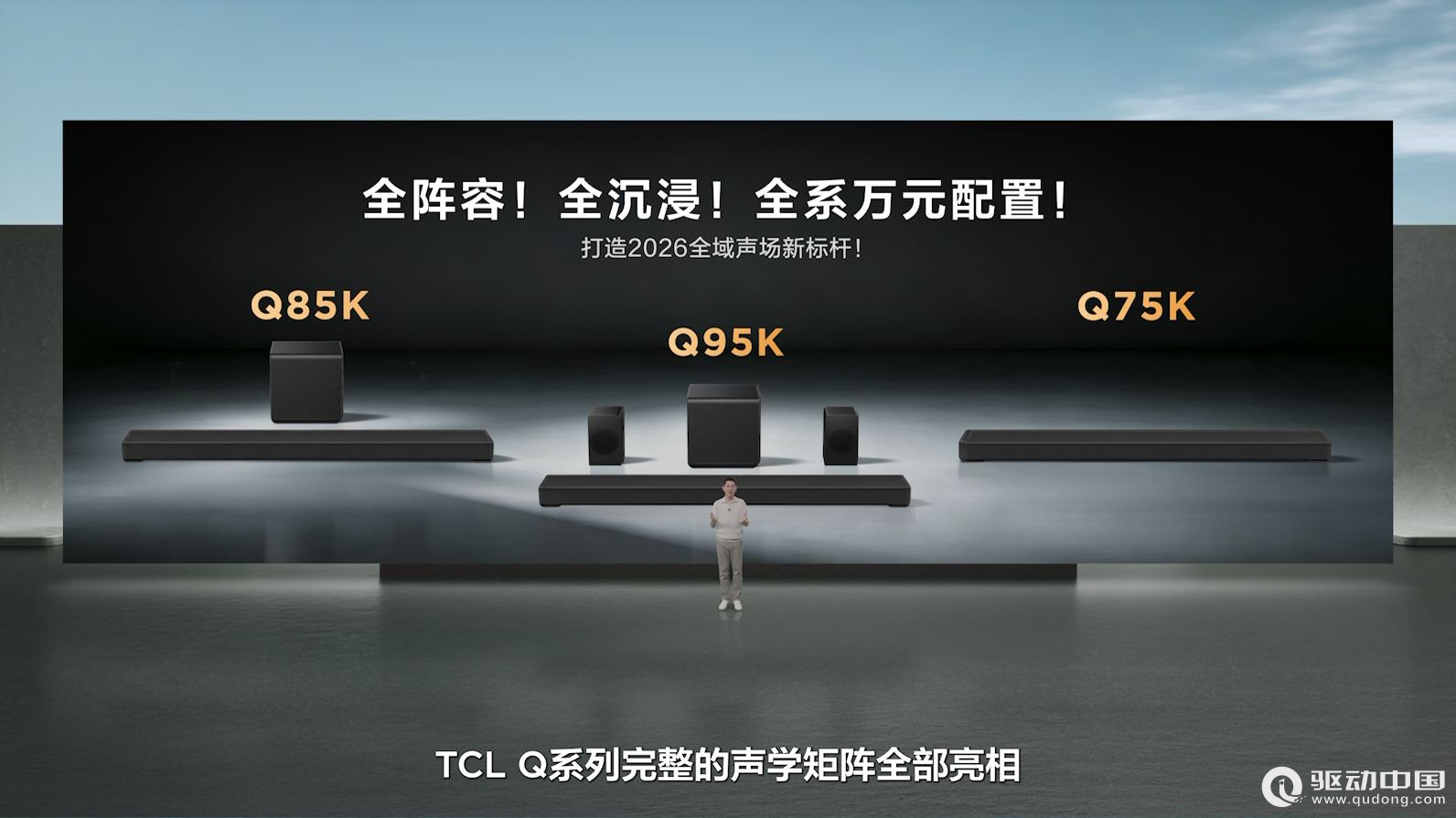
TCL发布Q系列旗舰回音壁:打破海外垄断,高端影音迎来中国声音
2026-07-27
CSS布局常用的方法:float:none|left|right
取值:
none:??默认值。对象不飘浮
left:??文本流向对象的右边
right:??文本流向对象的左边
它是怎样工作的,看个一行两列的例子
xhtml:
<div id="wrap">
<div id="column1">这里是第一列</div>
<div id="column2">这里是第二列</div>
<div class="clear"></div> /*这是违背web标准意图的,只是想说明在它下面的元素需要清除浮动*/
</div>
CSS:
#wrap{width:100;height:auto;}
#column1{float:left;width:40;}
#column2{float:right;width:60;}
.clear{clear:both;}
position:static|absolute|fixed|relative
取值:
static:??默认值。无特殊定位,对象遵循HTML定位规则
absolute:??将对象从文档流中拖出,使用left,right,top,bottom等属性相对于其最接近的一个最有定位设置的父对象进行绝对定位。如果不存在这样的父对象,则依据body对象。而其层叠通过z-index属性定义
fixed:??未支持。对象定位遵从绝对(absolute)方式。但是要遵守一些规范
relative:??对象不可层叠,但将依据left,right,top,bottom等属性在正常文档流中偏移位置
它来实现一行两列的例子
xhtml:
<div id="wrap">
<div id="column1">这里是第一列</div>
<div id="column2">这里是第二列</div>
</div>
CSS:
#wrap{position:relative;/*相对定位*/width:770px;}
#column1{position:absolute;top:0;left:0;width:300px;}
#column2{position:absolute;top:0;right:0;width:470px;}
他们的区别在哪?
显然,float是相对定位的,会随着浏览器的大小和分辨率的变化而改变,而position就不行了,所以一般情况下还是float布局!
CSS常用布局实例
单行一列
body{margin:0px;padding:0px;text-align:center;}
#content{margin-left:auto;margin-right:auto;width:400px;}
两行一列
body{margin:0px;padding:0px;text-align:center;}
#content-top{margin-left:auto;margin-right:auto;width:400px;}
#content-end{margin-left:auto;margin-right:auto;width:400px;}
三行一列
body{margin:0px;padding:0px;text-align:center;}
#content-top{margin-left:auto;margin-right:auto;width:400px;width:370px;}
#content-mid{margin-left:auto;margin-right:auto;width:400px;}
#content-end{margin-left:auto;margin-right:auto;width:400px;}
单行两列
#bodycenter{width:700px;margin-right:auto;margin-left:auto;overflow:auto;}
#bodycenter#dv1{float:left;width:280px;}
#bodycenter#dv2{float:right;width:420px;}
两行两列
#header{width:700px;margin-right:auto;margin-left:auto;overflow:auto;}
#bodycenter{width:700px;margin-right:auto;margin-left:auto;overflow:auto;}
#bodycenter#dv1{float:left;width:280px;}
#bodycenter#dv2{float:right;width:420px;}
三行两列
#header{width:700px;margin-right:auto;margin-left:auto;}
#bodycenter{width:700px;margin-right:auto;margin-left:auto;}
#bodycenter#dv1{float:left;width:280px;}
#bodycenter#dv2{float:right;width:420px;}
#footer{width:700px;margin-right:auto;margin-left:auto;overflow:auto;clear:both;}
单行三列
绝对定位
#left{position:absolute;top:0px;left:0px;width:120px;}
#middle{margin:0px190px0px190px;}
#right{position:absolute;top:0px;right:0px;width:120px;}
float定位
xhtml:
<div id="wrap">
<div id="column">
<div id="column1">这里是第一列</div>
<div id="column2">这里是第二列</div>
<div class="clear"></div>/*用法web标准不建议,但是记住下面元素需要清除浮动*/
</div>
<divid="column3">这里是第三列</div>
<divclass="clear"></div>/*用法web标准不建议,但是记住下面元素需要清除浮动*/
</div>
CSS:
#wrap{width:100;height:auto;}
#column{float:left;width:60;}
#column1{float:left;width:30;}
#column2{float:right;width:30;}
#column3{float:right;width:40;}
.clear{clear:both;}
float定位二
xhtml
<div id="center"class="column">
<h1>Thisisthemaincontent.</h1>
</div>
<div id="left"class="column">
<h2>Thisistheleftsidebar.</h2>
</div>
<div id="right"class="column">
<h2>Thisistherightsidebar.</h2>
</div>
CSS
body{
margin:0;
padding-left:200px;/*LCfullwidth*/
padding-right:190px;/*RCfullwidth CCpadding*/
min-width:200px;/*LCfullwidth CCpadding*/
}
.column{
position:relative;
float:left;
}
#center{
width:100;
}
#left{
width:200px;/*LCwidth*/
right:200px;/*LCfullwidth*/
margin-left:-100;
}
#right{
width:190px;/*RCwidth*/
margin-right:-100;
}
/***IEFix***/
*html#left{
left:190px;/*RCfullwidth*/
}
两行三列
xhtml:
<div id="header">这里是顶行</div>
<div id="warp">
<div id="column">
<div id="column1">这里是第一列</div>
<div id="column2">这里是第二列</div>
<div class="clear"></div>
</div>
<div id="column3">这里是第三列</div>
<div class="clear"></div>
</div>
CSS:
#header{width:100;height:auto;}
#wrap{width:100;height:auto;}
#column{float:left;width:60;}
#column1{float:left;width:30;}
#column2{float:right;width:30;}
#column3{float:right;width:40;}
.clear{clear:both;}
三行三列
xhtml:
<div id="header">这里是顶行</div>
<div id="wrap">
<div id="column">
<div id="column1">这里是第一列</div>
<div id="column2">这里是第二列</div>
<div class="clear"></div>
</div>
<div id="column3">这里是第三列</div>
<div class="clear"></div>
</div>
<div id="footer">这里是底部一行</div>
CSS:
#header{width:100;height:auto;}
#wrap{width:100;height:auto;}
#column{float:left;width:60;}
#column1{float:left;width:30;}
#column2{float:right;width:30;}
#column3{float:right;width:40;}
.clear{clear:both;}
#footer{width:100;height:auto;}
PS:这里列出的是常用的例子,而非研究之用,对一每个盒子,我都没有设置margin,padding,boeder等属性,是因为我个人觉得,含有宽度定位的时候,最好不好用到他们,除非必不得已,因为如果不是这样的话,解决浏览器兼容问题,会让你头疼,而且产生一系列CSS代码,我觉得这样的效率和效果都不好!
CSS布局高级技巧
margin和padding总是有可能要用到,而产生的问题如何解决呢?由于浏览器解释容器宽度的方法不同:
IE6.0FirefoxOpera等是
真实宽度=width padding border margin
IE5.X
真实宽度=width-padding-border-margin
IE中有浮动对象的双倍距离之BUG(IEDoubledFloat-MarginBug)
很明显,第一种下很完美的布局在第二种情况下后果是很凄惨的!
解决的方法是hack
div.content{
width:400px;//这个是错误的width,所有浏览器都读到了
voice-family:""}"";//IE5.X/win忽略了""}""后的内容
voice-family:inherit;
width:300px;//包括IE6/win在内的部分浏览器读到这句,新的数值(300px)覆盖掉了旧的
}
html>body.content{//html>body是CSS2的写法
width:300px;//支持CSS2该写法的浏览器(非IE5)有幸读到了这一句
}
div.content{
width:300px!important;//这个是正确的width,大部分支持!important标记的浏览器使用这里的数值
width(空格)/**/:400px;//IE6/win不解析这句,所以IE6/win仍然认为width的值是300px;而IE5.X/win读到这句,新的数值(400px)覆盖掉了旧的,因为!important标记对他们不起作用
}
html>body.content{//html>body是CSS2的写法
width:300px;//支持CSS2该写法的浏览器有幸读到了这一句
}
列等高技巧
n行n列布局,每列高度(事先并不能确定哪列的高度)的相同,是每个设计师追求的目标,做法有:背景图填充、加JS脚本的
方法和容器溢出部分隐藏和列的负底边界和正的内补丁相结合的方法。
背景图填充法:
xhtml:
<div id="wrap">
<div id="column1">这是第一列</div>
<div id="column1">这是第二列</div>
<div class="clear"></div>
</div>
css:
#wrap{width:776px;background:url(bg.gif)repeat-y300px;}
#column1{float:left;width:300px;}
#column2{float:right;width:476px;}
.clear{clear:both;}
就是将一个npx宽的一张图片在外部容器纵向重复,定位到两列交错的位置纵向重复,在视觉上产生了两列高度一样的错觉。
评论 {{userinfo.comments}}
{{child.content}}

 {{money}}元


{{question.question}}
提交


