
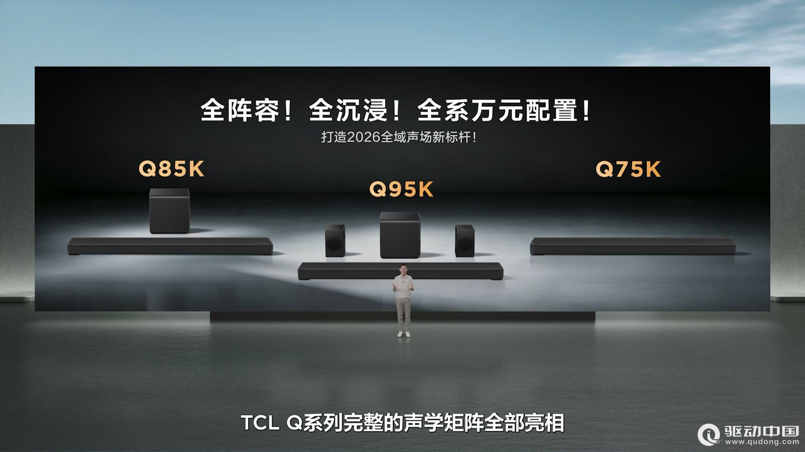
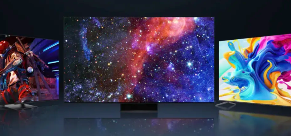
TCL发布Q系列旗舰回音壁:打破海外垄断,高端影音迎来中国声音
2026-07-27
float:none|left|right
取值:
none:?默认值。对象不飘浮
left:?文本流向对象的右边
right:?文本流向对象的左边
它是怎样工作的,看个一行两列的例子
xhtml代码:
Example Source Code [www.devdao.com]
<div id="wrap">
<div id="column1">这里是第一列</div>
<div id="column2">这里是第二列</div>
<div class="clear"></div> /*这是违背web标准意图的,只是想说明在它下面的元素需要清除浮动*/
</div>
CSS代码:
Example Source Code [www.devdao.com]
#wrap{width:100;height:auto;}
#column1{float:left;width:40;}
#column2{float:right;width:60;}
.clear{clear:both;}
position:static|absolute|fixed|relative
取值:
static:?默认值。无特殊定位,对象遵循HTML定位规则
absolute:?将对象从文档流中拖出,使用left,right,top,bottom等属性相对于其最接近的一个最有定位设置的父对象进行绝对定位。如果不存在这样的父对象,则依据body对象。而其层叠通过z-index属性定义
fixed:?未支持。对象定位遵从绝对(absolute)方式。但是要遵守一些规范
relative:?对象不可层叠,但将依据left,right,top,bottom等属性在正常文档流中偏移位置
它来实现一行两列的例子
xhtml代码:
Example Source Code [www.devdao.com]
<div id="wrap">
<div id="column1">这里是第一列</div>
<div id="column2">这里是第二列</div>
</div>
CSS代码:
Example Source Code [www.devdao.com]
#wrap{position:relative;/*相对定位*/width:770px;}
#column1{position:absolute;top:0;left:0;width:300px;}
#column2{position:absolute;top:0;right:0;width:470px;}
他们的区别在哪?
显然,float是相对定位的,会随着浏览器的大小和分辨率的变化而改变,而position就不行了,所以一般情况下还是float布局!
CSS常用布局实例
单行一列
Example Source Code [www.devdao.com]
body{margin:0px;padding:0px;text-align:center;}
#content{margin-left:auto;margin-right:auto;width:400px;}
两行一列
Example Source Code [www.devdao.com]
body{margin:0px;padding:0px;text-align:center;}
#content-top{margin-left:auto;margin-right:auto;width:400px;}
#content-end{margin-left:auto;margin-right:auto;width:400px;}
三行一列
Example Source Code [www.devdao.com]
body{margin:0px;padding:0px;text-align:center;}
#content-top{margin-left:auto;margin-right:auto;width:400px;width:370px;}
#content-mid{margin-left:auto;margin-right:auto;width:400px;}
#content-end{margin-left:auto;margin-right:auto;width:400px;}
单行两列
Example Source Code [www.devdao.com]
#bodycenter{width:700px;margin-right:auto;margin-left:auto;overflow:auto;}
#bodycenter#dv1{float:left;width:280px;}
#bodycenter#dv2{float:right;width:420px;}
两行两列
Example Source Code [www.devdao.com]
#header{width:700px;margin-right:auto;margin-left:auto;overflow:auto;}
#bodycenter{width:700px;margin-right:auto;margin-left:auto;overflow:auto;}
#bodycenter#dv1{float:left;width:280px;}
#bodycenter#dv2{float:right;width:420px;}
三行两列
Example Source Code [www.devdao.com]
#header{width:700px;margin-right:auto;margin-left:auto;}
#bodycenter{width:700px;margin-right:auto;margin-left:auto;}
#bodycenter#dv1{float:left;width:280px;}
#bodycenter#dv2{float:right;width:420px;}
#footer{width:700px;margin-right:auto;margin-left:auto;overflow:auto;clear:both;}
单行三列
绝对定位
Example Source Code [www.devdao.com]
#left{position:absolute;top:0px;left:0px;width:120px;}
#middle{margin:0px190px0px190px;}
#right{position:absolute;top:0px;right:0px;width:120px;}
float定位一
xhtml代码:
Example Source Code [www.devdao.com]
<div id="wrap">
<div id="column">
<div id="column1">这里是第一列</div>
<div id="column2">这里是第二列</div>
<div class="clear"></div>/*用法web标准不建议,但是记住下面元素需要清除浮动*/
</div>
<divid="column3">这里是第三列</div>
<divclass="clear"></div>/*用法web标准不建议,但是记住下面元素需要清除浮动*/
</div>
CSS代码:
Example Source Code [www.devdao.com]
#wrap{width:100;height:auto;}
#column{float:left;width:60;}
#column1{float:left;width:30;}
#column2{float:right;width:30;}
#column3{float:right;width:40;}
.clear{clear:both;}
float定位二
xhtml代码:
Example Source Code [www.devdao.com]
<div id="center"class="column">
<h1>Thisisthemaincontent.</h1>
</div>
<div id="left"class="column">
<h2>Thisistheleftsidebar.</h2>
</div>
<div id="right"class="column">
<h2>Thisistherightsidebar.</h2>
</div>
CSS代码:
Example Source Code [www.devdao.com]
body{
margin:0;
padding-left:200px;/*LCfullwidth*/
padding-right:190px;/*RCfullwidth CCpadding*/
min-width:200px;/*LCfullwidth CCpadding*/
}
.column{
position:relative;
float:left;
}
#center{
width:100;
}
#left{
width:200px;/*LCwidth*/
right:200px;/*LCfullwidth*/
margin-left:-100;
}
#right{
width:190px;/*RCwidth*/
margin-right:-100;
}
评论 {{userinfo.comments}}
{{child.content}}

 {{money}}元

{{question.question}}
提交


